(11) 2088-5701


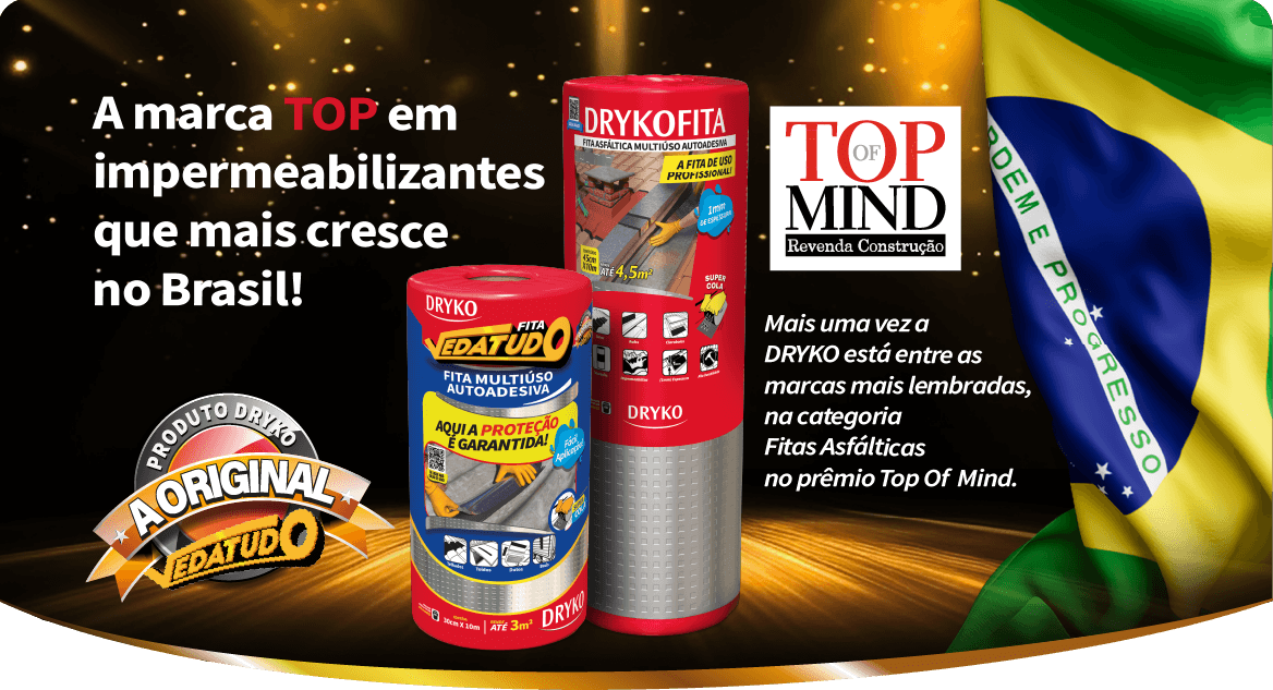
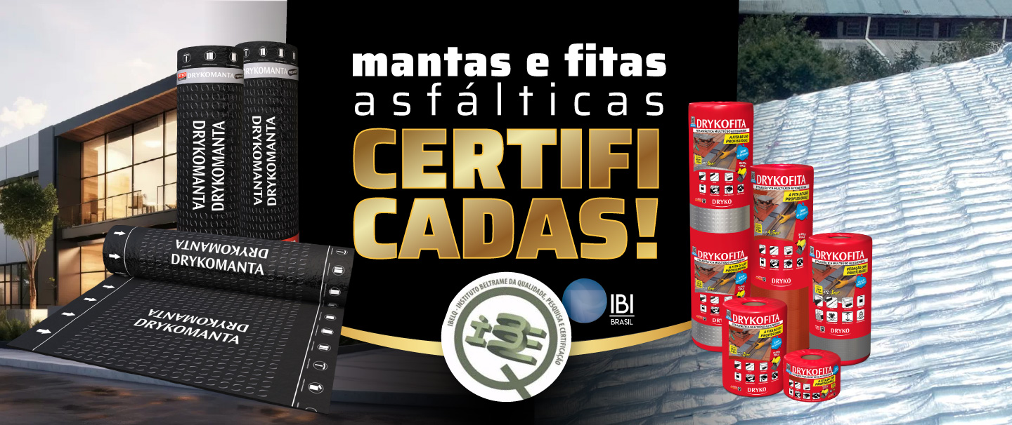
Mantas e Fitas
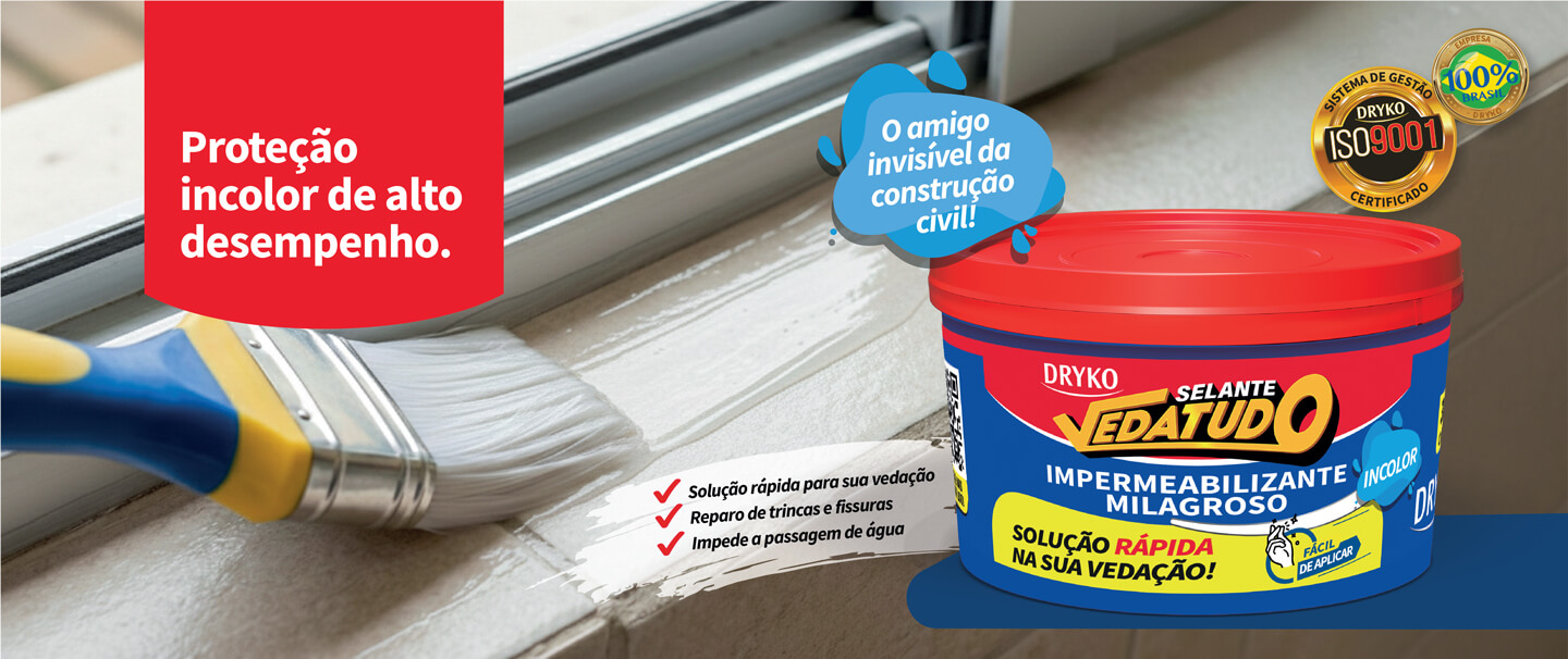
Milagroso
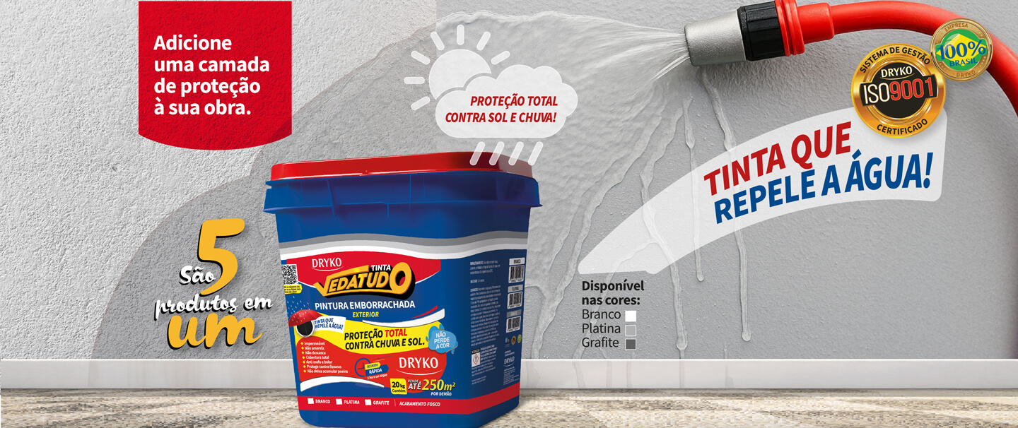
Tinta Emborrachada
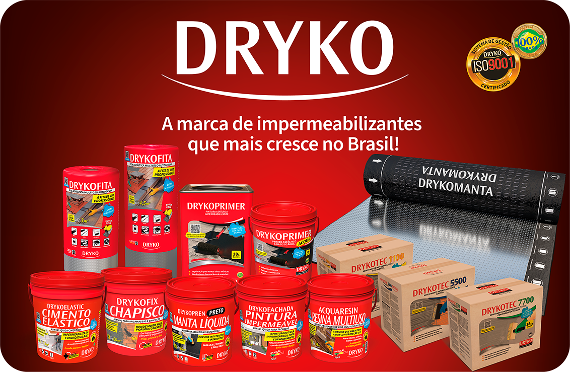
Conheça nossas linhas de Produtos:
DRYKO e VEDATUDO.
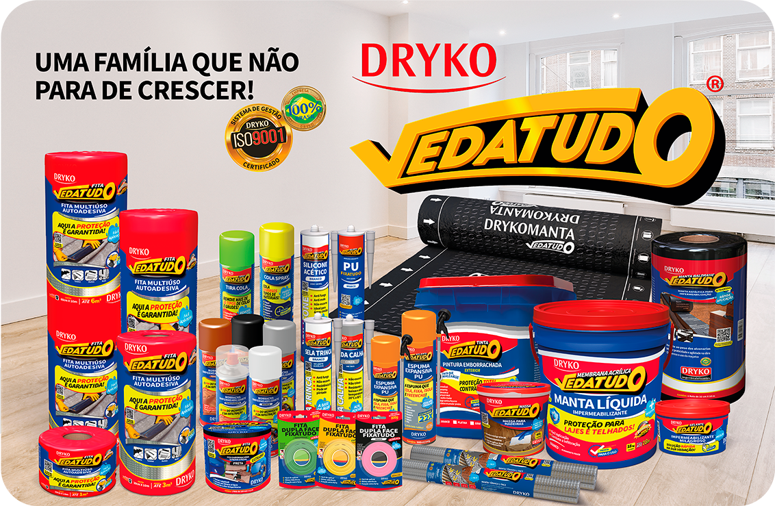
Categoria de Produtos da Linha VEDATUDO

VERSÃO BETA
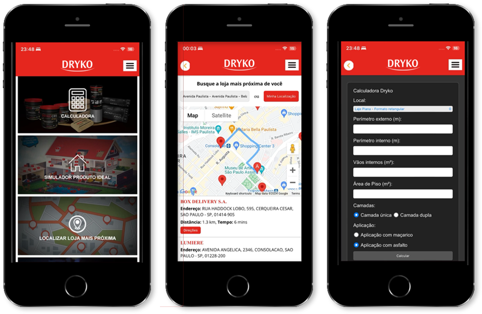
App DRYKO
Com simulador e calculadora de impermeabilização completa para você.
Agora já é possível localizar as lojas que ficam mais próximas da sua localização.
Tudo isso com controle total, direto do App.